Color
Color Structure
Color palettes do not use specific color names or incremental values for color instead we go from a range of darkest through to lightest this allows us to change the specific color without affecting the class name and provide us with more flexibility.
To change the colors open the variables panel and update the values according to the class structure.
To change the colors open the variables panel and update the values according to the class structure.
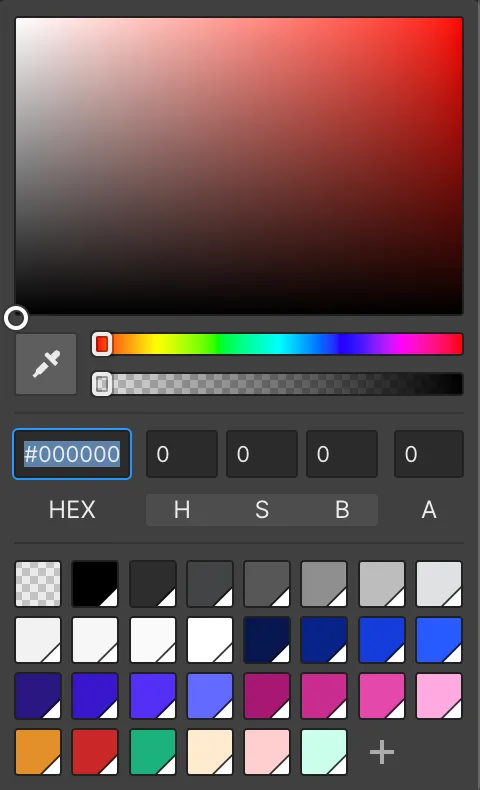
Hover each color to view its HEX values, then simply click to copy to clipboard.
Primary
Primary Dark
HEX:
RGB:
HEX:
RGB:
Primary
HEX:
RGB:
HEX:
RGB:
Primary Mid
HEX:
RGB:
HEX:
RGB:
Primary Lightest
HEX:
RGB:
HEX:
RGB:
Secondary Dark
HEX:
RGB:
HEX:
RGB:
Secondary
HEX:
RGB:
HEX:
RGB:
Secondary Mid
HEX:
RGB:
HEX:
RGB:
Secondary Light
HEX:
RGB:
HEX:
RGB:
Tertiary Dark
HEX:
RGB:
HEX:
RGB:
Tertiary
HEX:
RGB:
HEX:
RGB:
Tertiary Mid
HEX:
RGB:
HEX:
RGB:
Tertiary Light
HEX:
RGB:
HEX:
RGB:
Greyscale
Darkest
HEX:
RGB:
HEX:
RGB:
Darker
HEX:
RGB:
HEX:
RGB:
Dark
HEX:
RGB:
HEX:
RGB:
Medium-Dark
HEX:
RGB:
HEX:
RGB:
Medium
HEX:
RGB:
HEX:
RGB:
Medium Light
HEX:
RGB:
HEX:
RGB:
Light
HEX:
RGB:
HEX:
RGB:
Lighter
HEX:
RGB:
HEX:
RGB:
Lightest
HEX:
RGB:
HEX:
RGB:
Mono
Black
HEX:
RGB:
HEX:
RGB:
White
HEX:
RGB:
HEX:
RGB:
Notification
Notifications dictate states of UI, so in the instance there is a form error we use one of the following to highlight, these colors should match accessibility to AA standard minimum if possible.
Error
HEX:
RGB:
HEX:
RGB:
Caution
HEX:
RGB:
HEX:
RGB:
Success
HEX:
RGB:
HEX:
RGB:
Error Highlight
HEX:
RGB:
HEX:
RGB:
Caution Highlight
HEX:
RGB:
HEX:
RGB:
Success Highlight
HEX:
RGB:
HEX:
RGB:
Border Colors
Notifications dictate states of UI, so in the instance there is a form error we use one of the following to highlight, these colors should match accessibility to AA standard minimum if possible.
Element
Border Size
Style
Color
Borders
Border
1.5px
Solid
Class
All